Basic Shape
Human Care Frame consists of Korean alphabets ‘ㄷ’ and ‘ㄱ’ which symbolize the philosophy and passion of Dongkook for the health and happiness of human beings and English logo at the center symbolizes ‘Brand Dongkook’ who works with people in the world.
Brand colors of Green and Blue mean Dongkook Pharmaceutical who works for bright and healthy future of human beings and the color Deep Blue means trust and courtesy.
Minimum Use Regulation
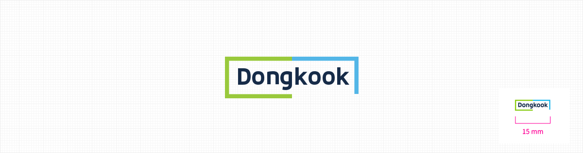
Considering the readability of the primary, it is not allowed to use the length and width of less than 15mm. Except, it is allowed to use less than 15mm only for the package.
Space Regulation
The space setting which surrounds the primary follows the standard of minimum space setting to maintain the optimum condition of readability and attractiveness.
Securing a primary range from other visual elements such as typography, photo image, and picture image, readability and attractiveness will be maintained. Regulated space is the minimum standard and it is recommended to secure sufficient space if possible.
Combination of Korean and English alphabets
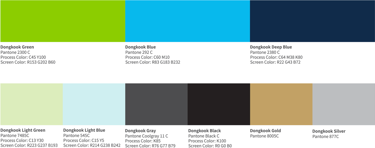
Representing Colors
Color Palette
Color palette of Dongkook Pharmaceutical can be utilized for various visual objects. All products of Dongkook Pharmaceutical are judged by the standard of pen tone color. As colors used under the digital environment may differ by medium, we adjust the colors presented according to the screen color standard.